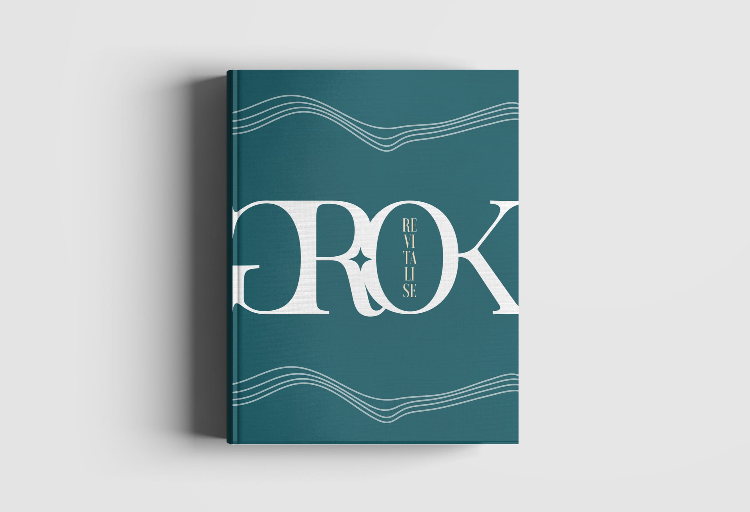
GROK is defined as, “To understand something intuitively or by empathy. When an observer groks something, he becomes one with the observed.” The restaurant is not defined by any particular cuisine, it groks several global cooking styles into one dining experience. Local Goan towns are made to grok spirits, resulting in refreshing cocktails; and several other experiences like these made up GROK.
- Fresh
- Flexible
- Young at heart
- Approachable luxury
- Contemporary meets tradition
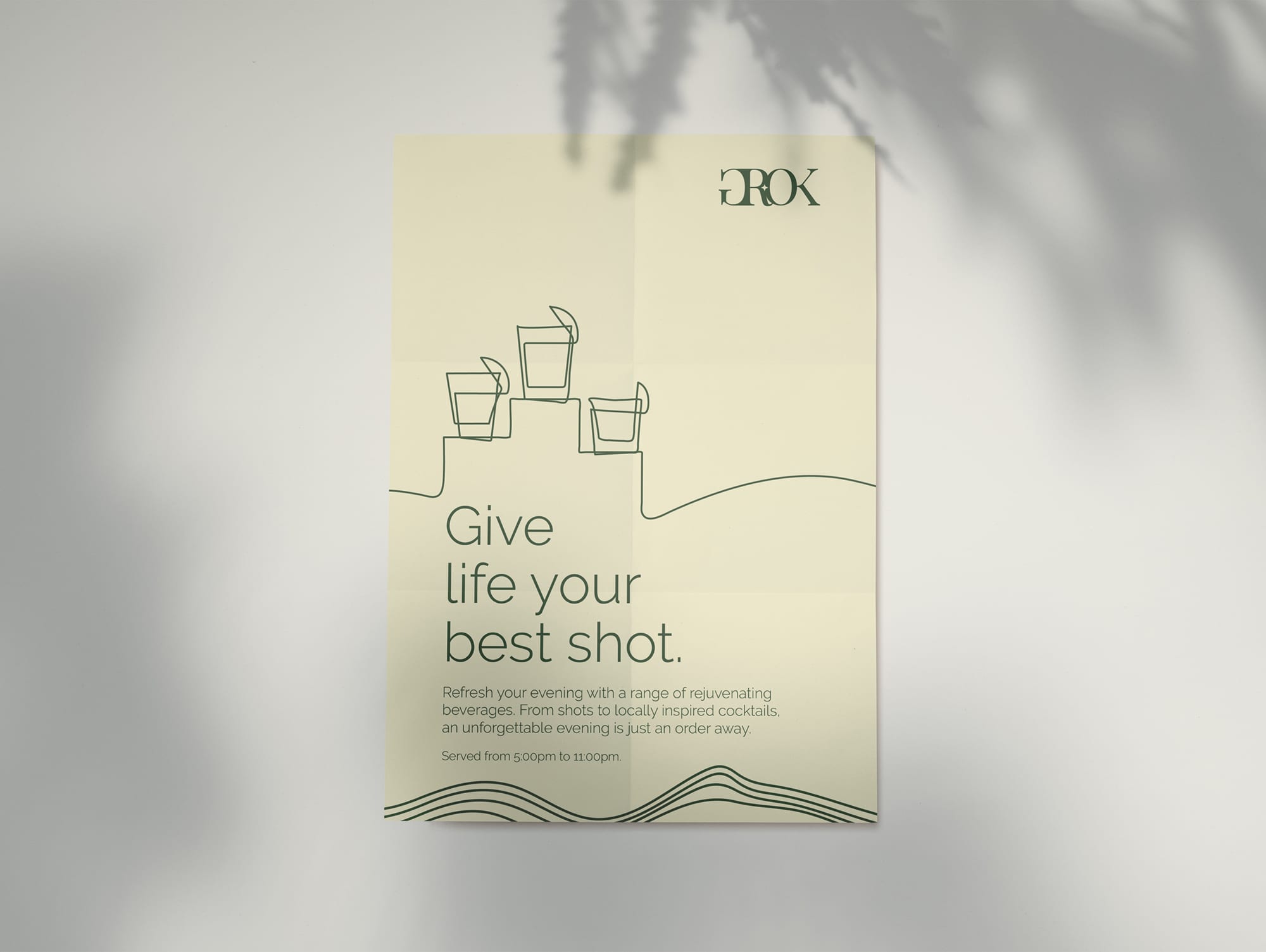
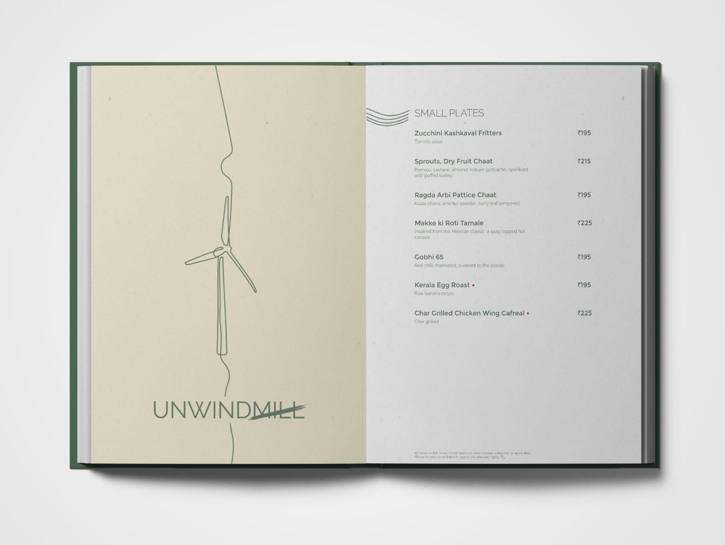
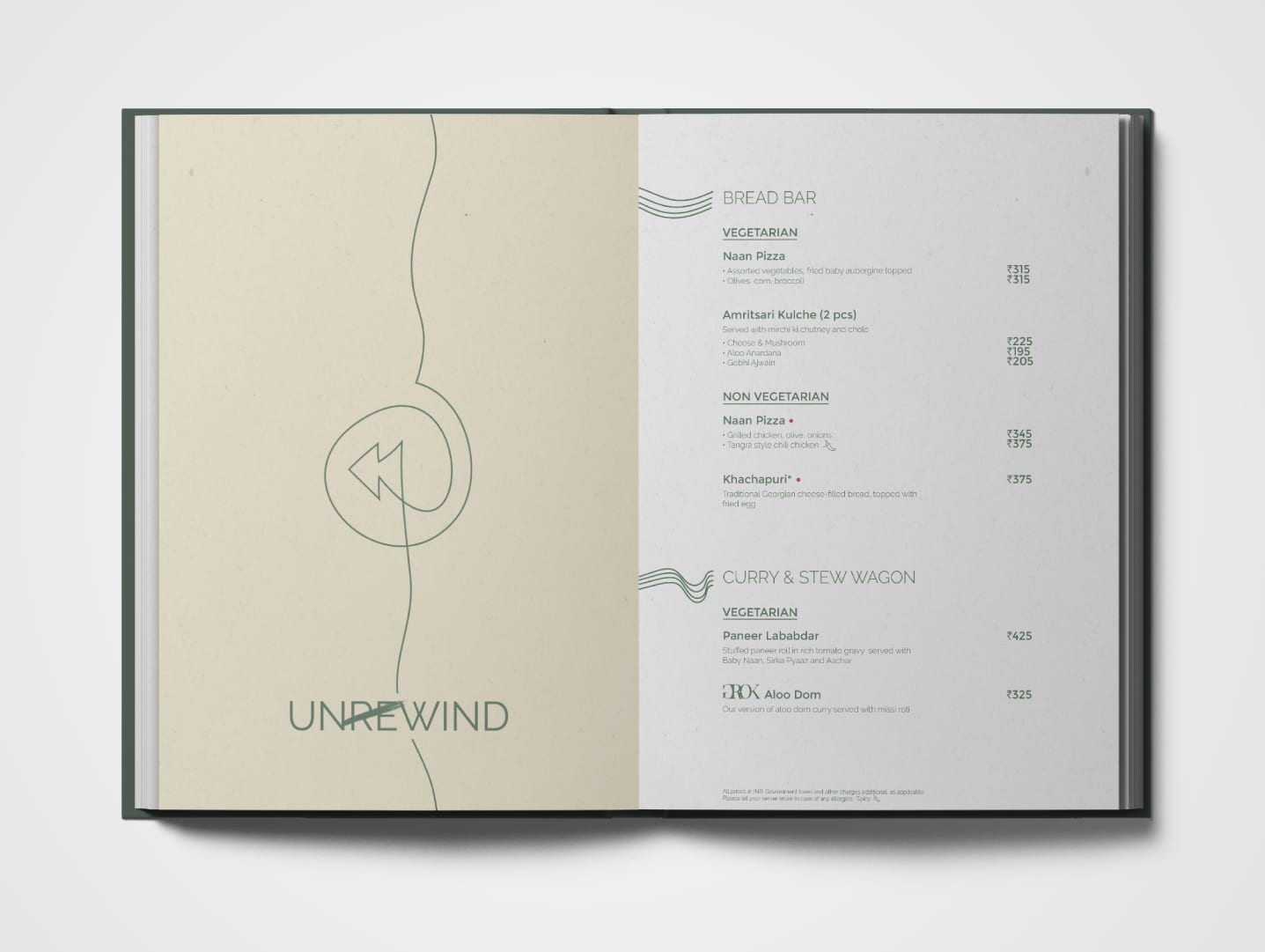
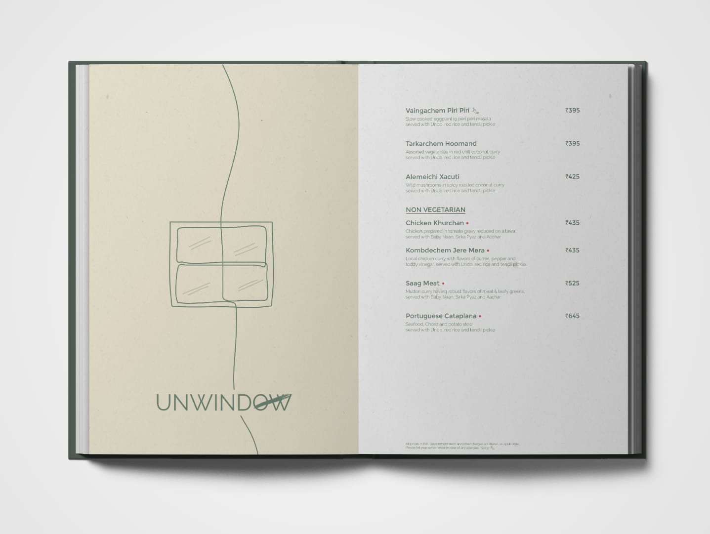
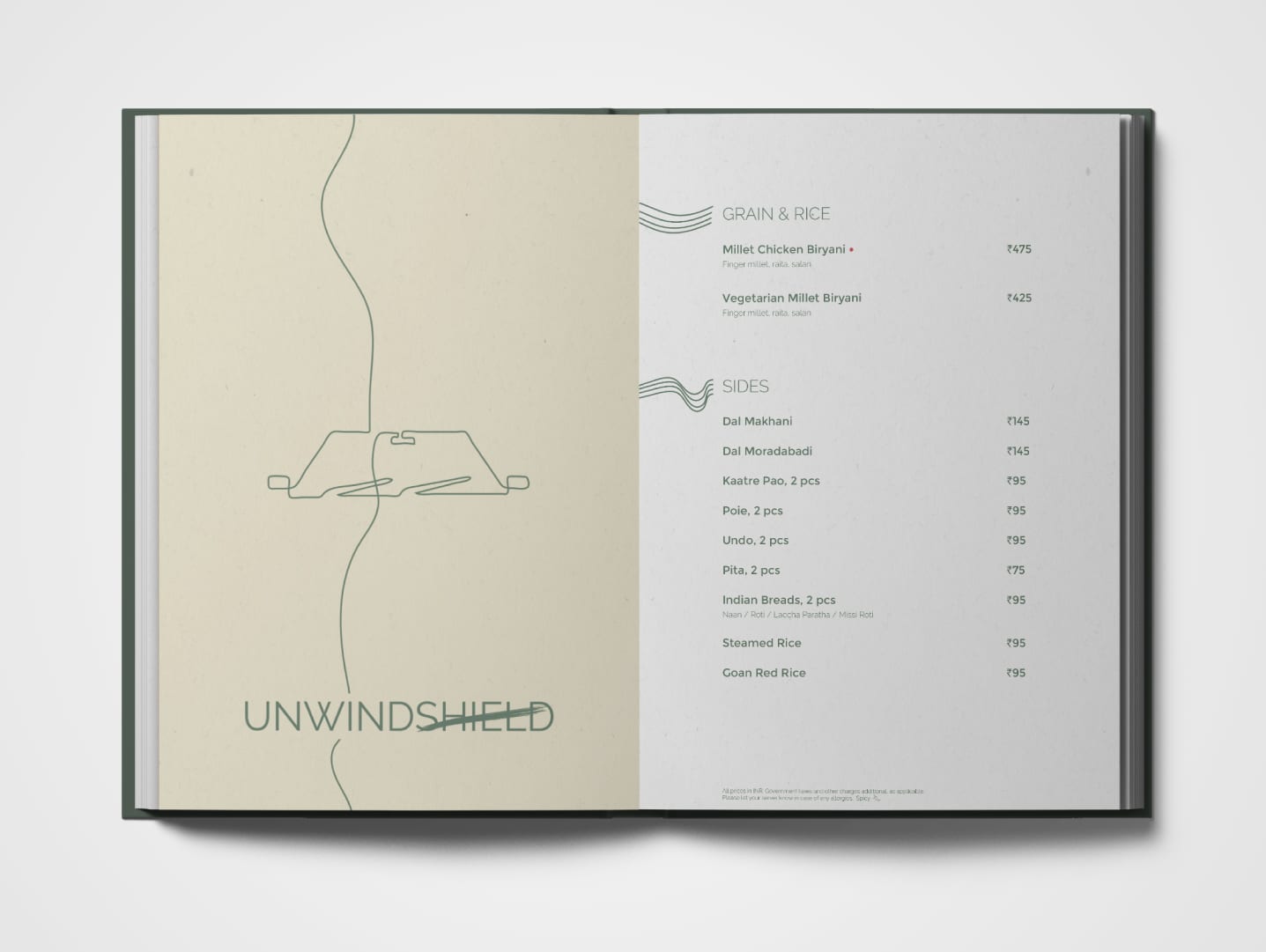
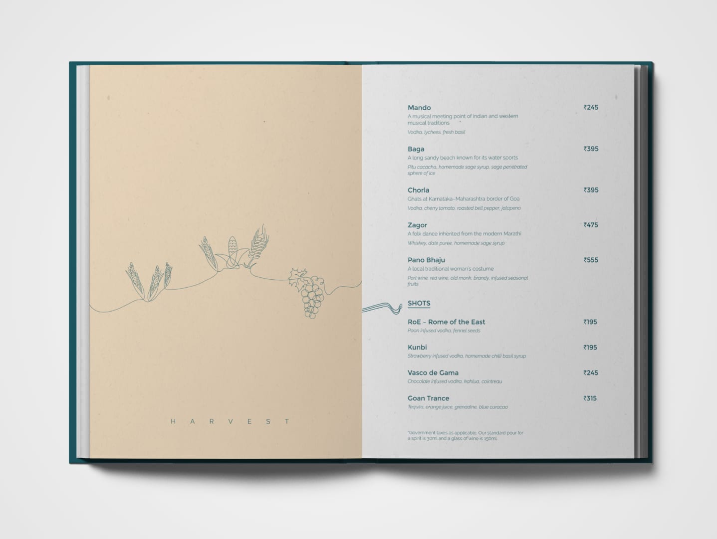
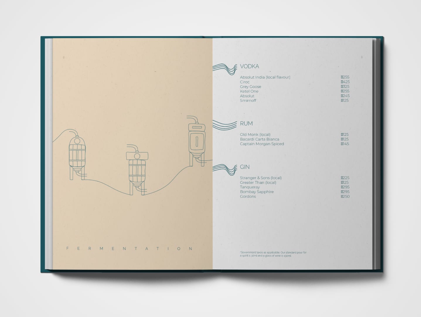
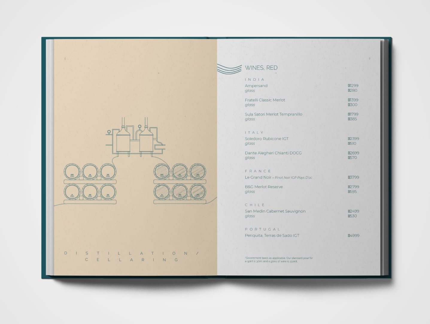
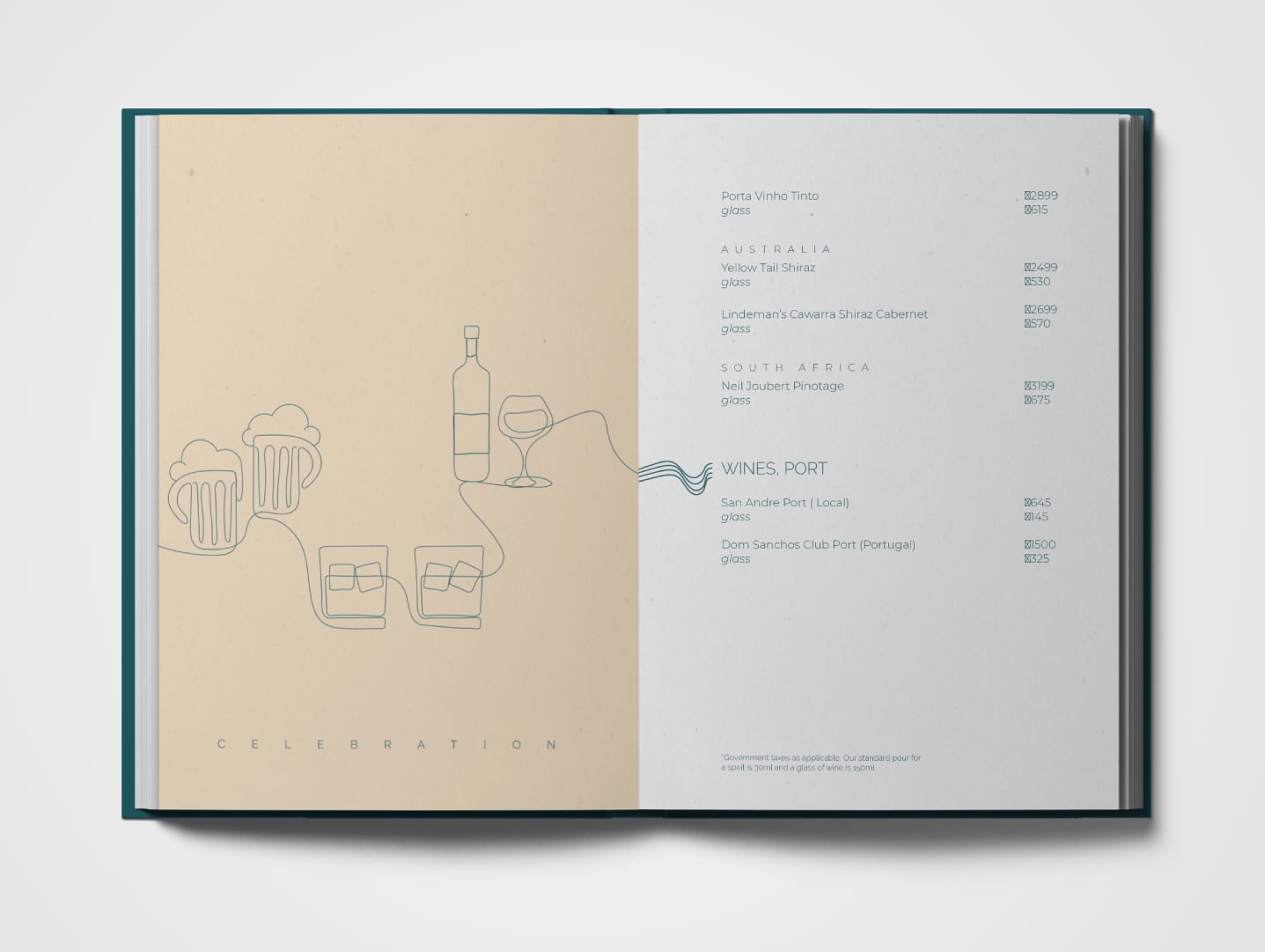
As a part of designing several touch-points for the brand, we created quirky posters that were placed in and around the premises of the restaurant. In addition to the visuals, the writing also brings out the brand personality. Since the term GROK also means to merge/blend, the copy contains homonyms/contronyms/wordplay so as to ensure each poster groks more than one interpretation. The posters highlight different sections of the menu. Just like every other collateral, creative and design, the illustrations were created using free-flowing wires to subtly highlight the flexibility of the brand (among other visual pillars).
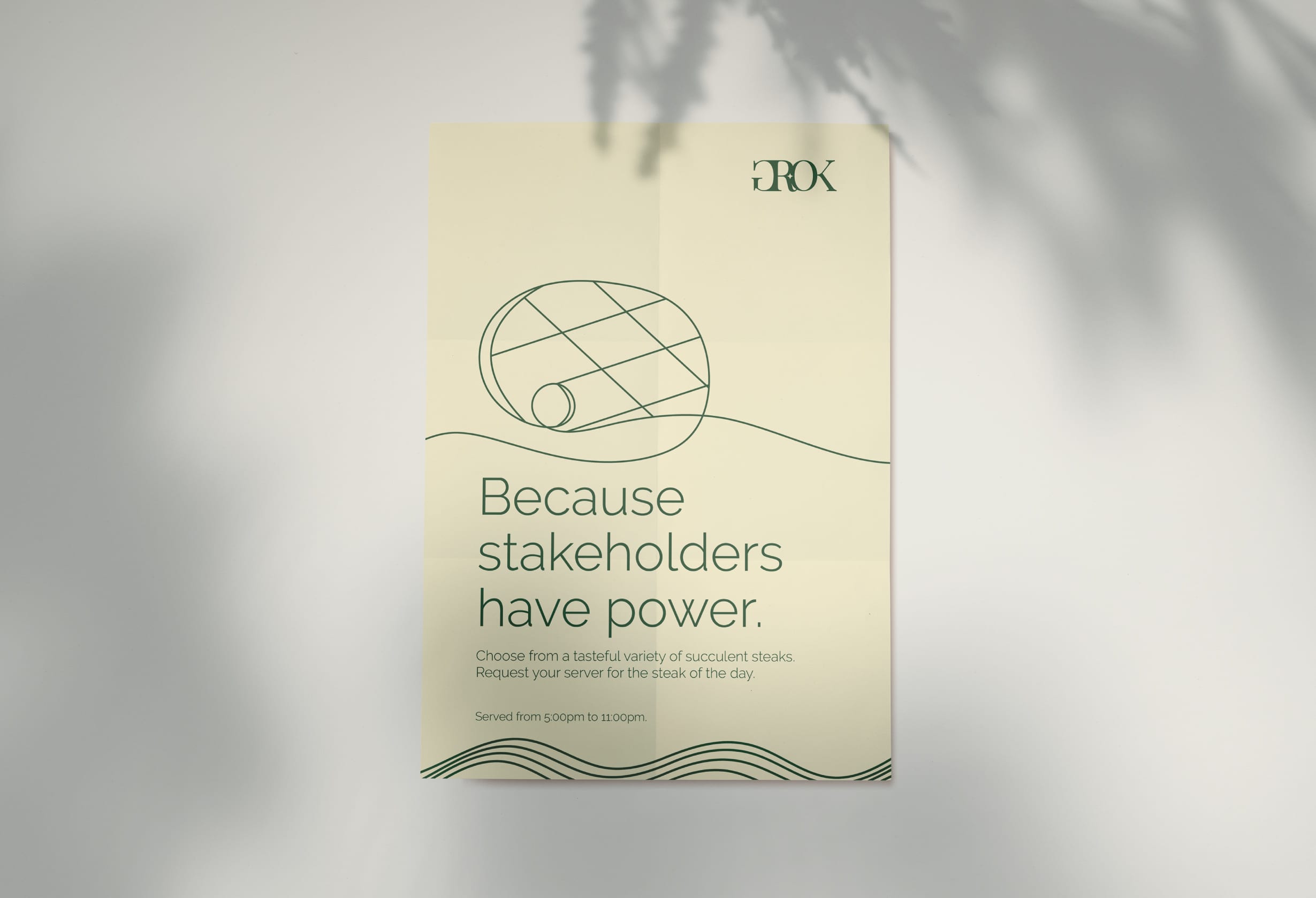
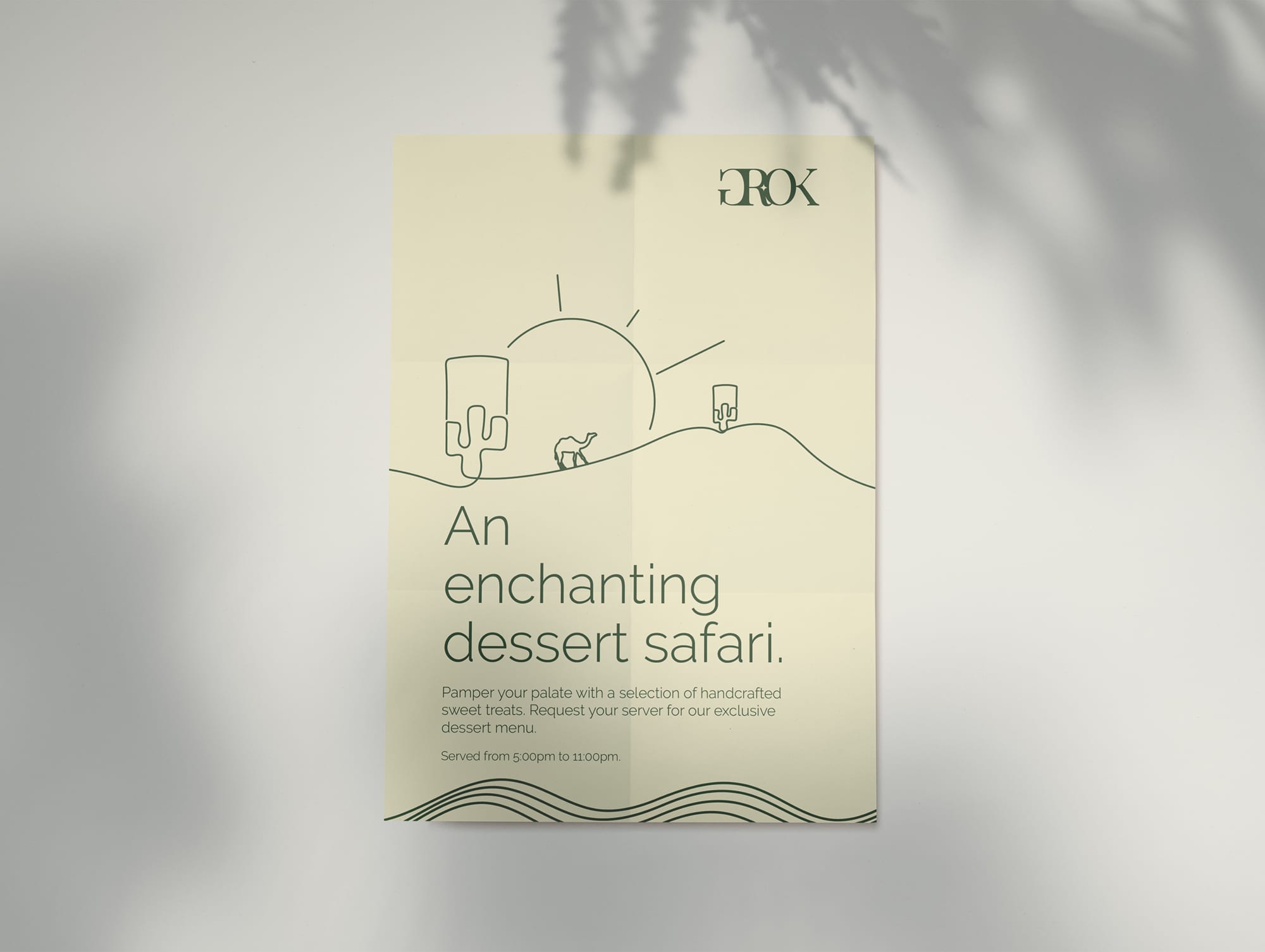
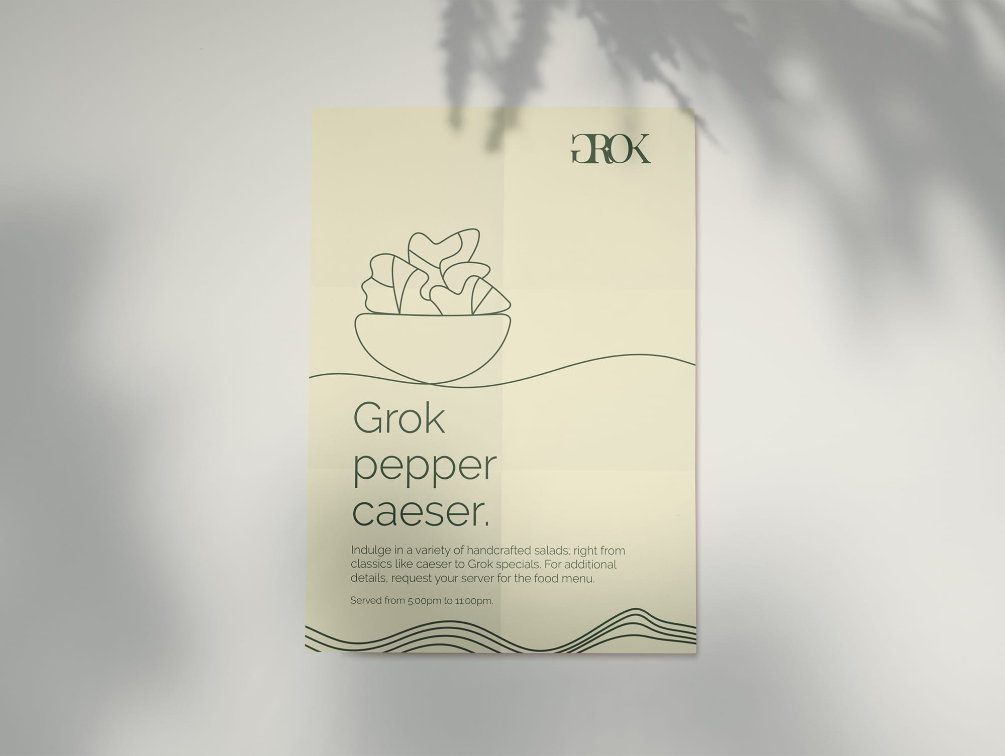
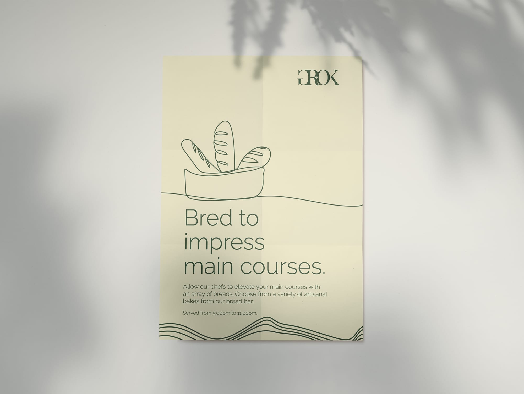
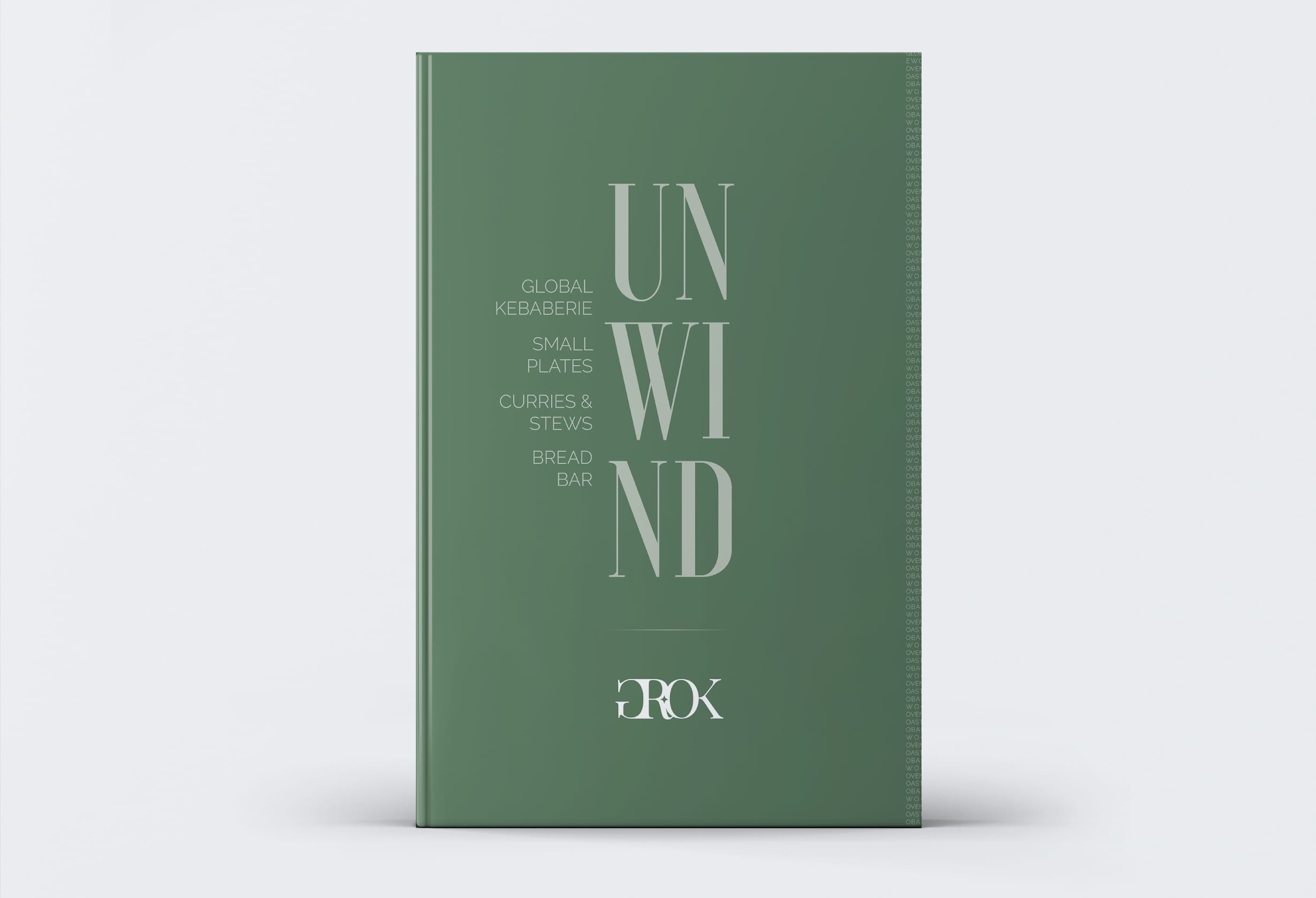
The GROK food menu has been named as Unwind, a term that also forms the philosophy of the culinary offerings. It contains a series of illustrations that aim to re-iterate the philosophy of the food menu (i.e., Unwind). Once you look at all the illustrations, you'll GROK the concept easily and you'll get a pseudo experience of GROK. Additionally, all the illustrations eventually mean one thing or form one thing (something very similar to GROK). The GROK food menu contains illustrations that have grokked the core philosophy of the menu. The resulting visuals are intermarried and eventually lead to one thing – Unwind.
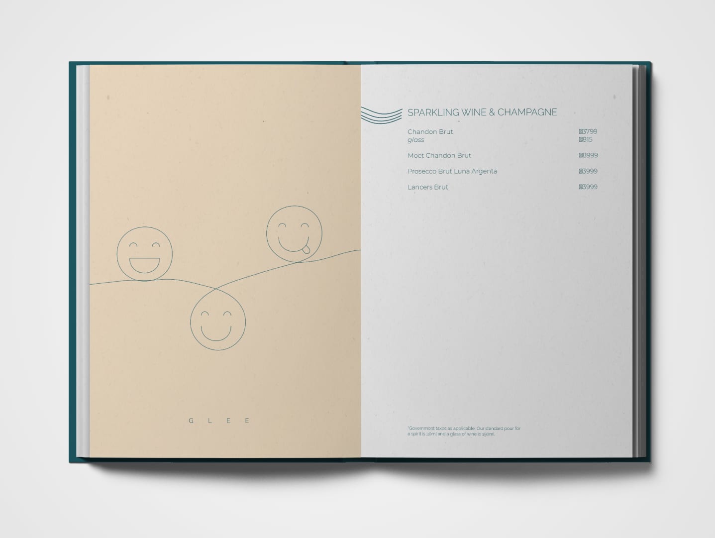
The beverage menu has been named as Revitalise. The illustrations in this menu show how glee/a revitalised spirit is the result of several processes GROKKED together.
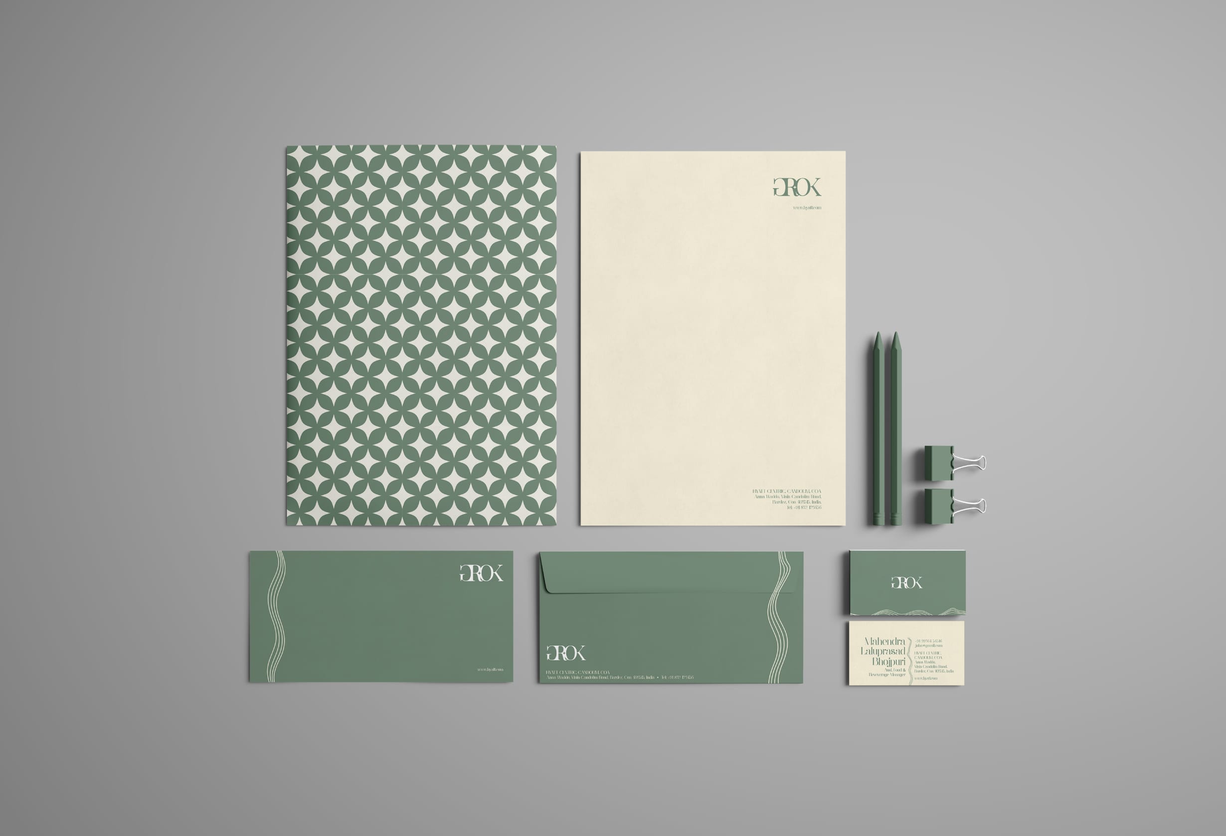
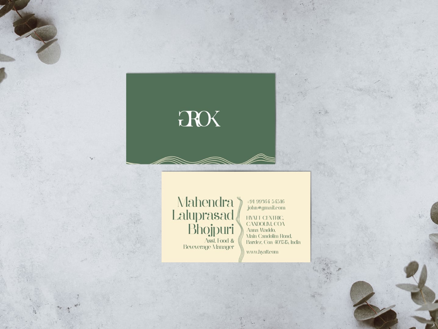
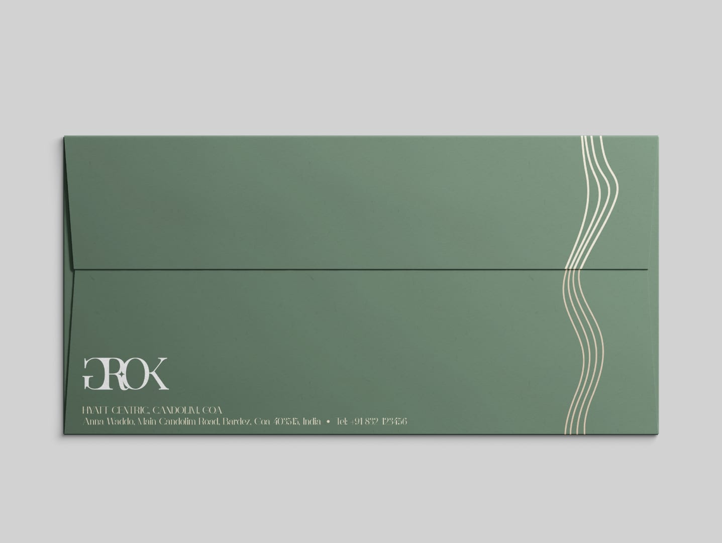
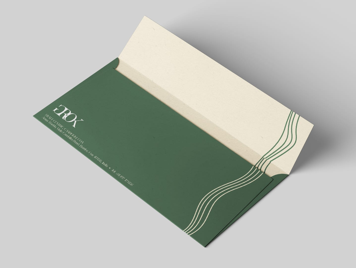
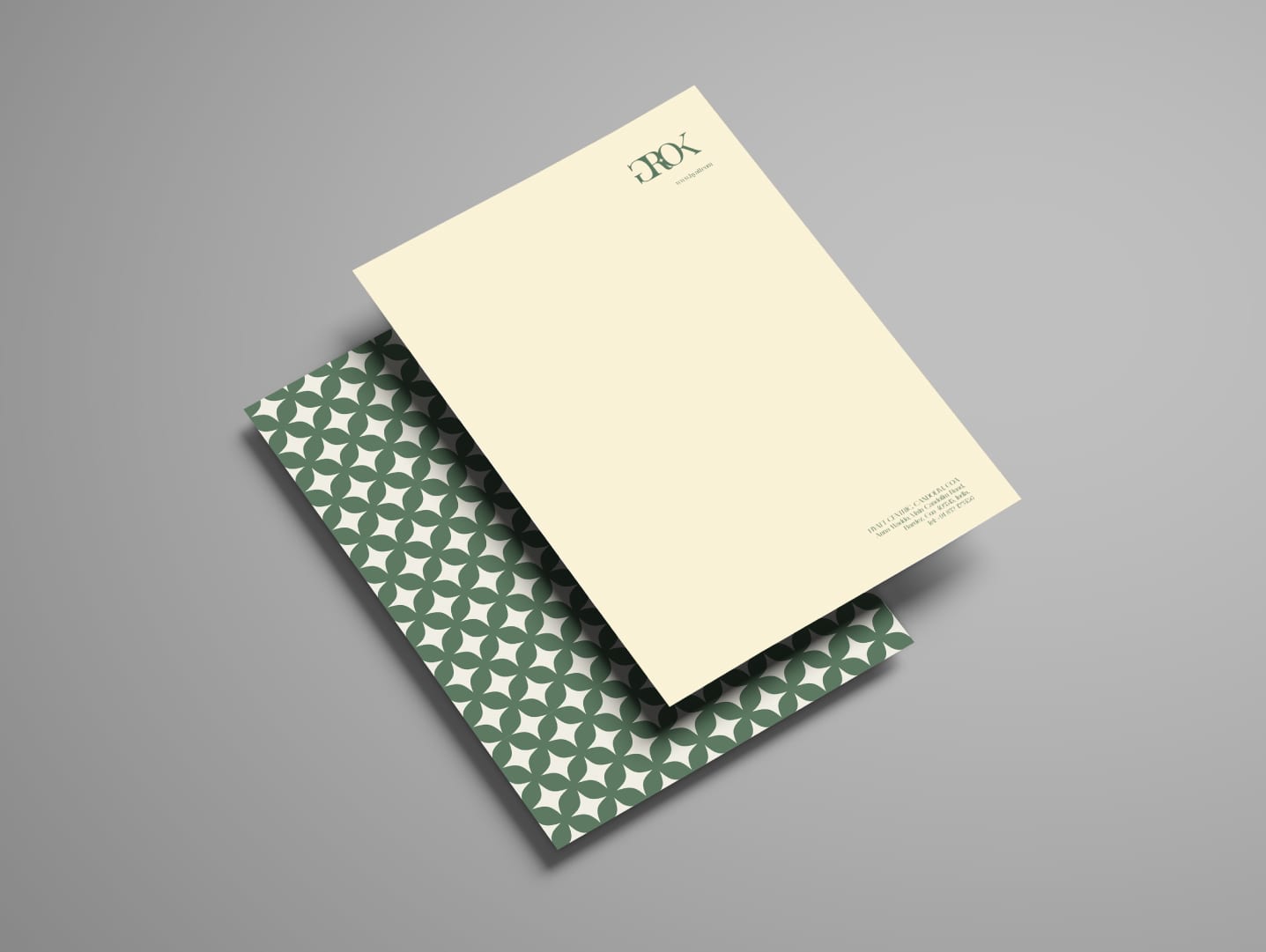
A snapshot of the stationery design.